Ranking of the Premier League’s New Home Kits for the Upcoming Season

As the excitement builds for another Premier League season, fans are treated to the spectacle of footballers showcasing their team’s new kits. The trend of clubs filming players’ reactions to their new jerseys has become quite popular, often leading to awkward smiles and phrases like, “Yeah, that’s nice.” While players must keep their opinions positive, we are free to share our thoughts. Here, we present a ranking of this season’s new Premier League home kits.

-
20. Chelsea
Oh dear, Chelsea’s new kit raises eyebrows. It resembles a lava lamp explosion more than a football jersey. It appears to be an attempt at modernity that has gone awry, making it look like something from a sci-fi film. Not a fan of this one.
-
19. Southampton
This is not a Southampton kit; it feels more like a throwback to Brentford or Sunderland. While it has the necessary branding, it lacks the spirit of Southampton’s heritage and is disappointingly bland compared to last season’s vibrant retro design.
-
18. Wolves
Wolves’ new shirt, produced by the relatively unknown Sudu, seems like a first attempt at a football kit design. The shirt lacks creativity and appears more suited for a restaurant than a football pitch, leaving fans wanting something more traditional.
-
17. Ipswich Town
Returning to the Premier League, Ipswich’s new kit feels unfamiliar. The absence of traditional white sleeves and the darker blue collar is a departure from what fans expect. While fine, it lacks the distinct identity of the club.
-
16. West Ham United
West Ham’s kit could be mistaken for any of their recent designs. While it’s a solid, classic look, it’s a bit tedious to see the same concept recycled. It’s nice, but fans may feel frustrated at being asked to buy yet another iteration of a similar shirt.
-
15. Manchester City
City’s new kit features the Manchester dialing code, 0161, on the collar and cuffs. However, the execution is poor, with the details almost invisible from a distance, rendering the concept rather pointless.
-
14. Bournemouth
Bournemouth’s kit was the last to be unveiled, and while it is a strong design with bold red and black stripes, the introduction of gold feels unnecessary. It seems to be an attempt to convey glamour rather than focusing on just playing well.
-
13. Brighton
Brighton’s new kit boasts extra stripes, which they marketed as a style enhancement. While it’s a decent design, the additional stripes may not be revolutionary. The kit is straightforward but features an unusual sleeve sponsor that raises eyebrows.
-
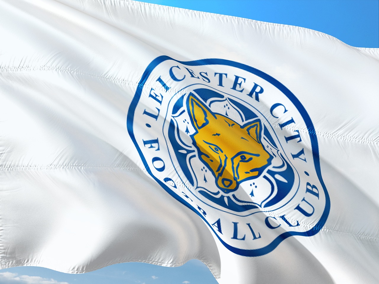
12. Leicester City
Adidas has opted for a minimalist approach with Leicester’s kit, which resembles several other teams’ shirts. While there’s nothing particularly wrong with it, the lack of distinctiveness feels like a missed opportunity.
-
11. Manchester United
United’s new kit features a “subtle gradient design,” which unfortunately translates to an appearance of sweat stains. Additionally, the shorts design makes players look like they’re wearing braces, giving off an unintended Victorian vibe.
-
10. Fulham
Fulham returns to a more classic look after last season’s daring design. The simplicity is appealing, but the oversized sleeve sponsor detracts from the overall aesthetic, drawing too much attention away from the club badge.
-
9. Nottingham Forest
This shirt follows the Adidas template but incorporates unique details, celebrating the club’s history. The two stars above the badge commemorate their European successes. Unfortunately, the sponsor’s logo is visually unappealing.
-
8. Crystal Palace
Palace’s kit is a bold choice, resembling an ambitious student project. Although it may not be universally loved, it showcases a distinct style that fans might embrace, making it a fun addition to the season.
-
7. Everton
Everton’s new kit offers a comforting classic look, reminiscent of their FA Cup-winning shirt from the mid-90s. Despite the shift from Hummel, the new design is a solid representation of the club’s identity.
-
6. Arsenal
Arsenal has hit the mark with a striking combination of blue on white for their shoulder stripes, reminiscent of their 1990s kits. This design strikes a balance between modernity and nostalgia, though the sponsor’s logo feels oversized.

-
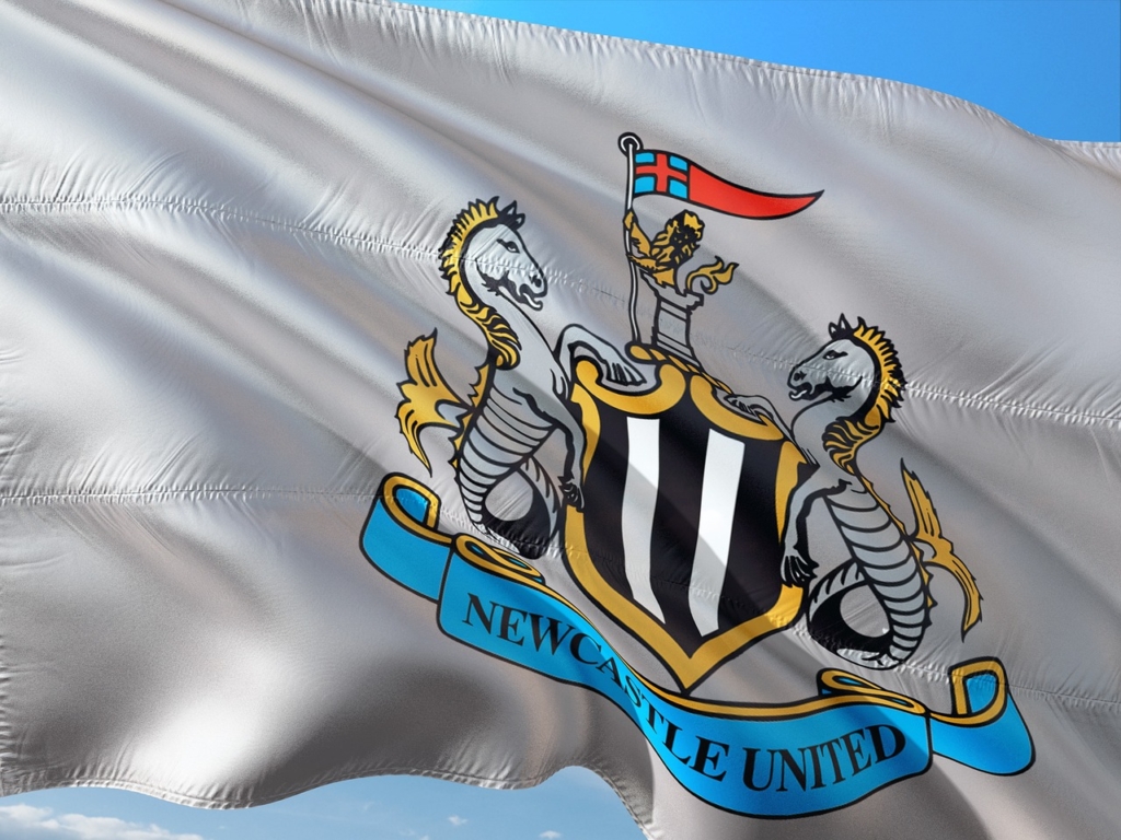
5. Newcastle United
Adidas’s return to Newcastle brings a classic look that resonates with fans of the club’s heyday. The simple yet effective design with black sleeves offers a nod to their glorious past, making it a favorite among supporters.
-
4. Brentford
Brentford continues its commendable tradition of releasing just one kit per season. While fans might miss a new design, the consistency is refreshing in a league filled with constant changes.
-
3. Aston Villa
Villa’s new kit has garnered positive reactions, combining a lighter shade of blue with maroon stripes. It pays homage to their 1982 European Cup win, making it both stylish and meaningful to fans.
-
2. Tottenham Hotspur
Spurs’ new shirt features a bold design with dark blue sleeves, evoking memories of past glories, albeit with a cautionary tale. The clean lines and well-placed sponsor logo enhance the overall look.
-
1. Liverpool
Liverpool’s new kit is a standout, though it might be easy to forget it was recently worn in the previous season’s finale. The subtle use of gold accents alongside an elegant design makes it a top choice for fans.
(Photos: Getty Images/Design: Dan Goldfarb)